He made this observation in the latest version (7th) of his Radiation Contour Map released in July, before the Fukushima prefectural government sheepishly published the data from the monitoring posts in Fukushima taken in March last year, which does show the spikes in radiation in locations in Fukushima Prefecture not after the explosions but after the change in the reactor pressure after the vent.
Professor Hayakawa of Gunma University first put up his hastily charted map on the Internet on April 8, 2011, after the Fukushima prefectural government announced the result of the radiation measurement in schools and kindergartens inside Fukushima. The first version of the map was released on the net on April 21, 2011. I remember seeing it, and also remember he was attacked for "fear-mongering". It was around that time that Iitate-mura was officially designated as "planned evacuation zone".
In the latest 7th version, Professor Hayakawa has done two things that are new:
The map is now double-sided, and on the backside he put the map comparing the contamination from the Chernobyl accident and and that from the Fukushima accident; he also put the chronological map of contamination.
The map is available online free, like all the previous versions, but this time the printed version is being actively sold in the physical world (for 200 yen in Japan), so that people who do not have access to the net can purchase.
From the tweets that I see, it's off to a good start.
The following is my translation of the text part of the map, with review and input from the professor. Emphasis is mine:
==========================================
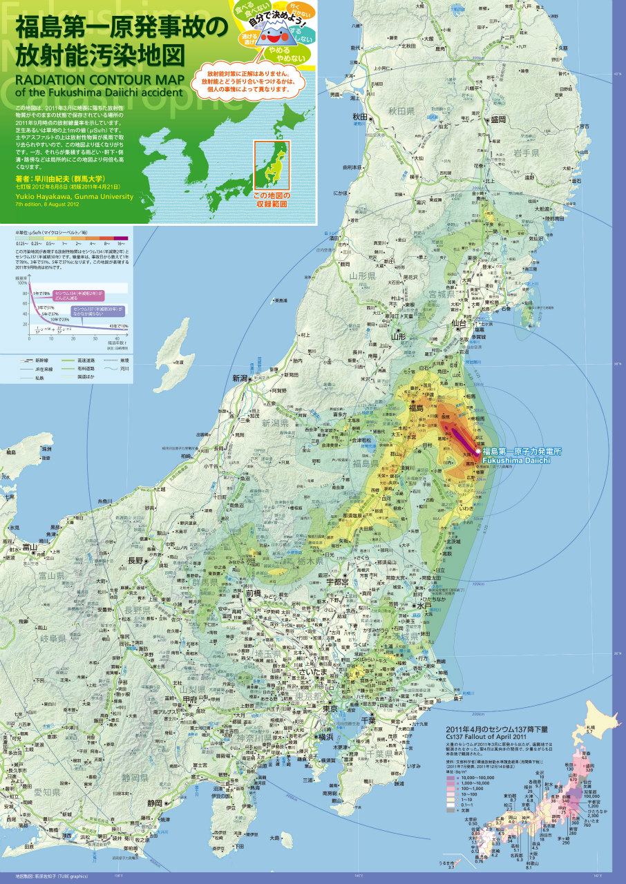
Front Page: Radiation Contour Map of the Fukushima Daiichi Accident
(Smiling blue volcano, one of Hayakawa's icons he uses on Twitter says the following)
Eat, not eat. Go, not go. Escape, not escape. Do, not do. Stop, not stop. Decide for yourself. There is no right or wrong answer to measures against radiation contamination. How to cope with radiation depends on personal circumstances.
(Text in the upper left box)
This map shows the dose rates of locations where radioactive materials that fell on the ground surface in March 2011 remain undisturbed. The values are as of September 2011, in microsievert per hour (μSv/h) at 1 meter off the ground surface of either turf or grass land. Radioactive materials get washed away from the dirt or asphalt surface by wind and rain, so the dose rates on these surfaces tend to be lower than what’s shown on the map. On the other hand, radioactive materials accumulate in rain gutters, on the ground under the roof overhang, in side drains, and on the side of the roads, resulting in the dose rates several times higher than what’s shown on the map.

Back Page: Birth of the Radiation Contour Map - What I Learned from Making the Map
(Main text, 1st row, with the Chernobyl-Fukushima comparison map)
In the afternoon on March 11, 2011, a huge earthquake and tsunami that happened in the Pacific Ocean off the coast of Tohoku destroyed Fukushima I (Daiichi) Nuclear Power Plant. For two weeks, a large amount of radioactive materials leaked from the plant. Areas as far away as Iitate-mura, 40 kilometers northwest of the plant, got severely contaminated. Nakadori (middle third) of Fukushima Prefecture, and the northern Gunma and Tochigi were also badly contaminated. Eastern part of the Tokyo Metropolitan region and southern Iwate were also contaminated. In the map on the front page, there are 8 levels of isopleths with the maximum at 16 μSv/h: 16, 8, 4, 2, 1, 0.5, 0.25 and 0.125. Needless to say, the radiation contamination extends beyond the 0.125 isopleth.
In the evening of April 8, 2011, the Nuclear Team of the Disaster Response Group of Fukushima Prefecture announced the dose rates at 1,648 schools and kindergartens in Fukushima. I found the data on the Internet, and picked one or two high numbers in each municipality, plotted on the Google Map, and made the map public that day with the three isopleths of 8, 2, and 0.5. That was the first of the radiation contour maps. Ms. Sachiko Hagiwara beautifully stylized the map, and it was published on the Internet on April 21, 2011 as the first version map (upper right).
I continued to collect information, and published the revised version on June 18, 2011. This version was the first to show the contamination in northern Tochigi and Gunma, eastern Tokyo Metropolitan region, and southern Iwate.
I revised the map every 3 months, and the current map is the 7th edition. This time, in addition to publishing on the Internet, I have decided to print on paper so that the map becomes more widely available for people who do not use the Internet.
(Main text, 2nd row, with the chronological contamination chart)
What determined the distribution of radiation contamination was the wind. Volcanic ashes from the volcanic eruption are transported by the wind at a high altitude of several kilometers and higher. However, radioactive materials leaked from the Fukushima I Nuclear Power Plant were transported by the wind near the ground surface. Looking at the meteorological data from that time period, wind directions at an altitude of 1 kilometer and higher cannot explain the distribution. I believe radioactive materials were carried by the surface wind whose altitude was dozens of meters off the ground at most. That’s the reason why the isopleths of radiation seem to follow the ups and downs of geography, such as basins and mountain sides.
The radioactive cloud that passed over Minamisoma City in Fukushima Prefecture at 9PM on March 12 continued past over Sendai Bay and reached Onagawa-cho in Miyagi Prefecture at 2AM on March 13.
The contamination on March 15 was the worst. The radioactive cloud that passed over Iwaki City in Fukushima Prefecture at 4AM reached Kanto Plain at 6AM. Since it was not raining, the cloud then headed west and north until it hit the mountainous regions in Kanto and northern part of Gunma and Tochigi Prefecture, where, for the first time, it rained, and radioactive materials came down on the ground with the rain. The contamination of Fukushima Nakadori (middle third) also happened on that day. Radioactive materials that crossed the Abukuma Mountains came down with the snow. In the afternoon, a particularly dense radioactive cloud was spewed from the nuclear plant. Carried by the wind, it went straight in the northwesterly direction, and contaminated the areas all the way to Iitate-mura, which the cloud hit at 6PM.
In the evening of March 20, areas near the Miyagi-Yamagata border and southern Iwate were contaminated. Then, the wind turned south, sending the cloud past Mito City in Ibaraki Prefecture at 6AM on March 21, and reaching Shinjuku, Tokyo at 9AM. For 3 days from March 21 to 23, the Kanto region had heavy, intermittent rains. Moderate contamination seen in the eastern part of the Tokyo Metropolitan region is from this time period.
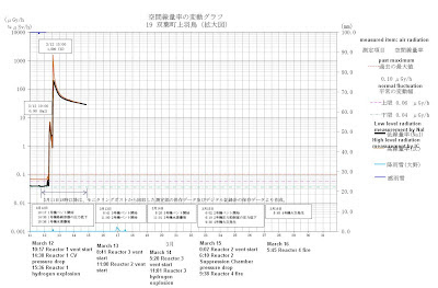
The dates and times of contamination that I have just explained above do not coincide with the dates and times of explosions that took place at Fukushima I Nuclear Power Plant. Unit 1 exploded at 3:36PM on March 12, and Unit 3 exploded at 11:01AM on March 14. However, it wasn’t at these moments when a large amount of radioactive materials leaked from the plant. Instead, the release of radioactive materials into the atmosphere seems to coincide well with the drop in the reactor pressure.
(Chronological chart, from the PDF. Click to enlarge.)

=============================================
Just below the chronological contamination chart, Hayakawa has an interesting map plotting the radioactive density (cesium) of fly ashes from the incinerators. Why is he interested in measuring ashes, "dirt on the roadside" (that's Hayakawa's way of calling what others have called "black dust"), and gutters where radiation levels are high? He answers, "First, in locations far away from the plant, you can clearly see the extent of contamination by measuring them. Second, by identifying them, you can clean them effectively." It looks he plotted the highest measurement found in these locations.
(from the PDF. Click to enlarge.)

If you are in Japan and if you read Japanese and want to purchase, Professor Hayakawa has set up "Kipuka Spirit Shop" where you can make an online purchase of this map in A-2 size. There are other "authorized" retailers listed on his blog post, here. The English version will come later (if I finish the rest of the translation, it seems).
If you only view it digitally, you can download it at his blog, or at the links here:
Front page(pdf 5.5MB、jpg 3.3MB)
Back page (pdf 8.7MB、jpg 2.7MB)
I hear that the map looks very good on iPad or other tablets. His digital map remains free of charge for non-commercial use. If you use part of his map to create a new map, it is free, even for commercial use. Hayakawa says he doesn't claim copyright for the title and text, but he claims moral rights of the author.





 Tokyo Time
![[Most Recent Quotes from www.kitco.com]](http://www.kitconet.com/charts/metals/gold/t24_au_en_usoz_2.gif)

